Headquarters
Zurich, Switzerland
Output
Mobile App Design
Custom Illustration
Marketing Design
Industry
Travel & Tourism
About the project
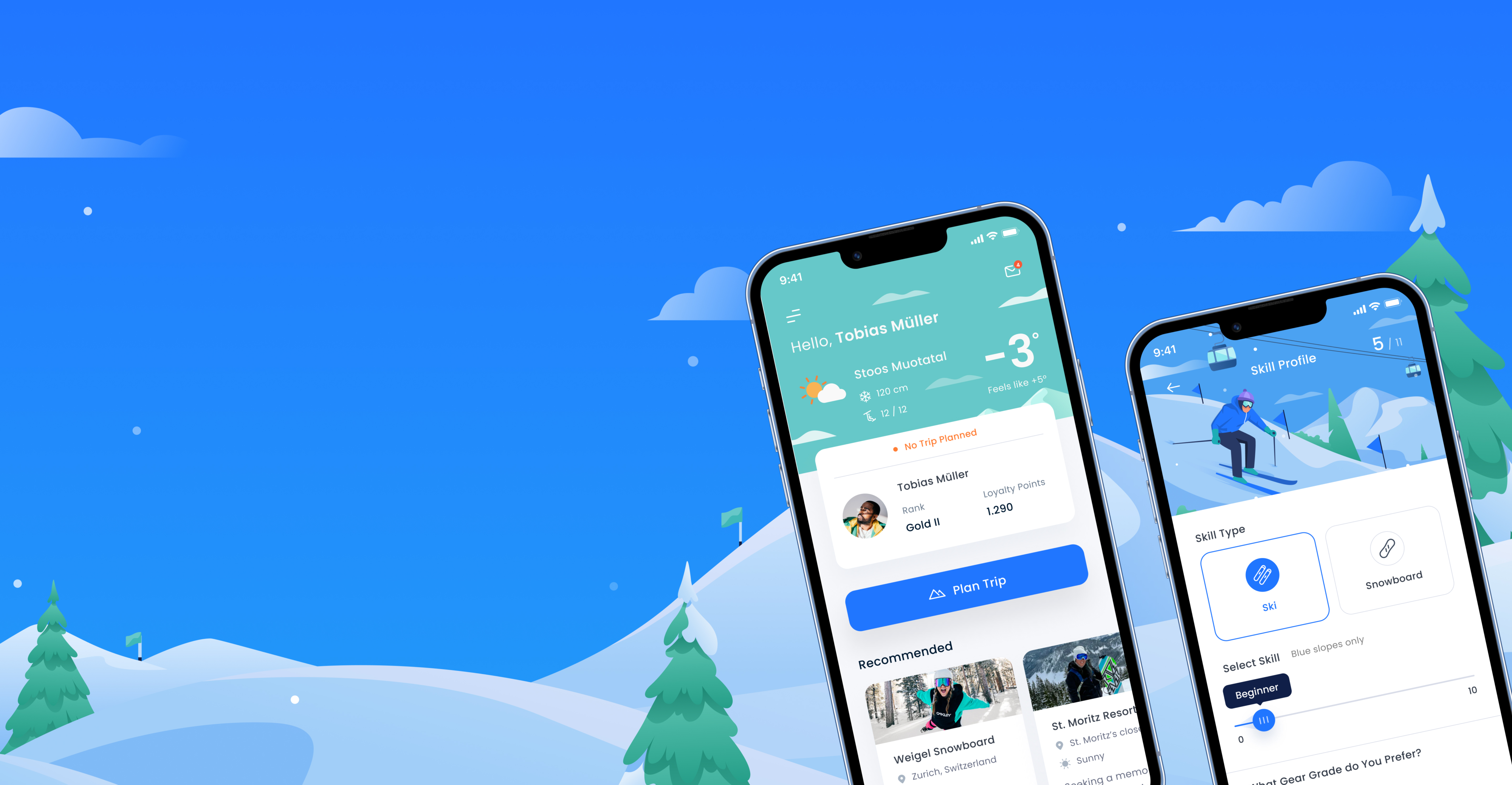
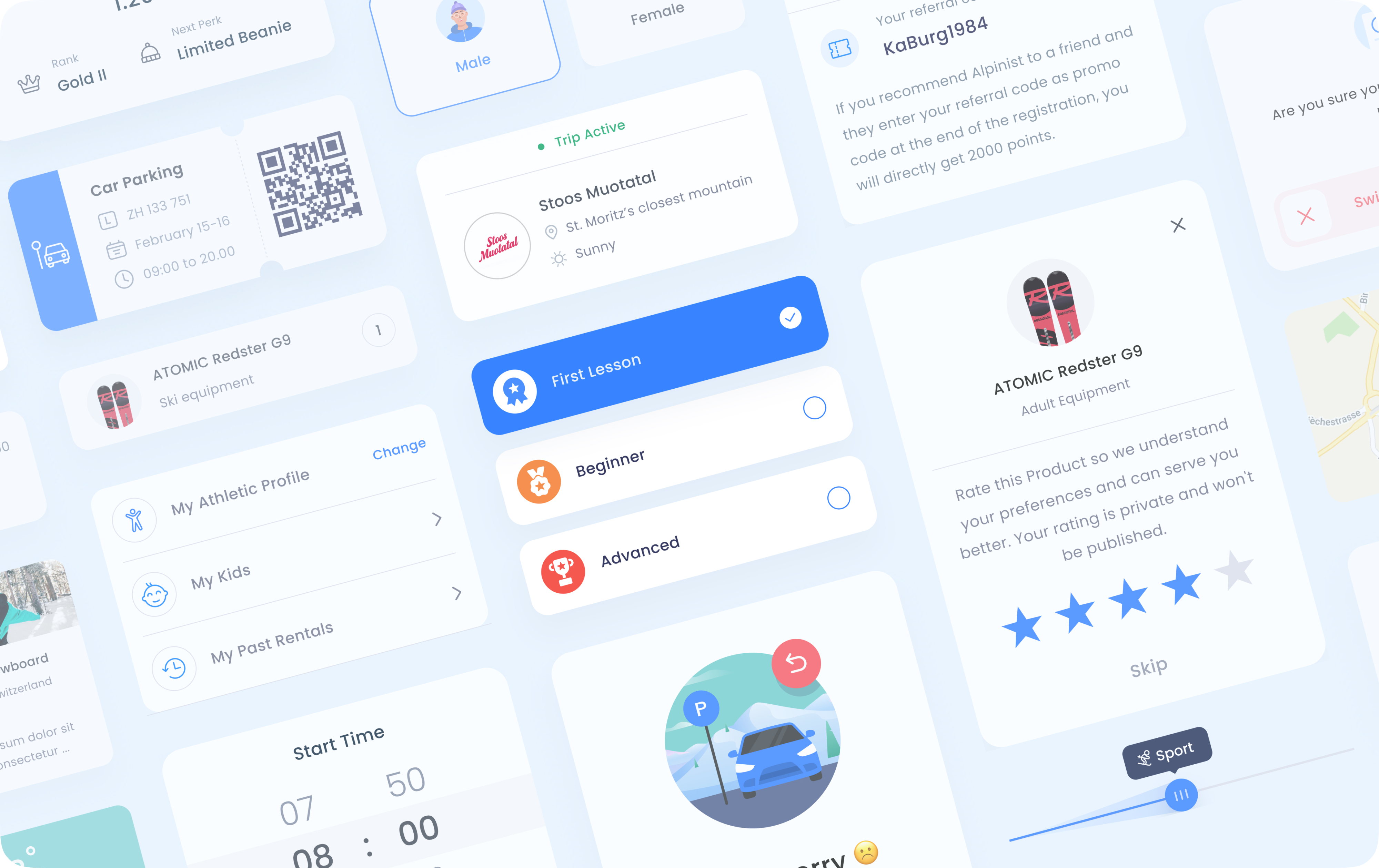
Alpinist as an app-based ski rental service that makes renting faster with hyper-perso-nalized experience that understand consumer behavior, eliminating the need to wait in lengthy queues outside in the cold.
The challenge
The complexity of the app can be overwhelming, so we focus on creating a seamless user interface that is intuitive and easy to use.
The solution
We created a UI design with a deep understanding of users to provide them with the best personalized experience that is also welcoming, informative, and intuitive.

DESIGN PROCESS
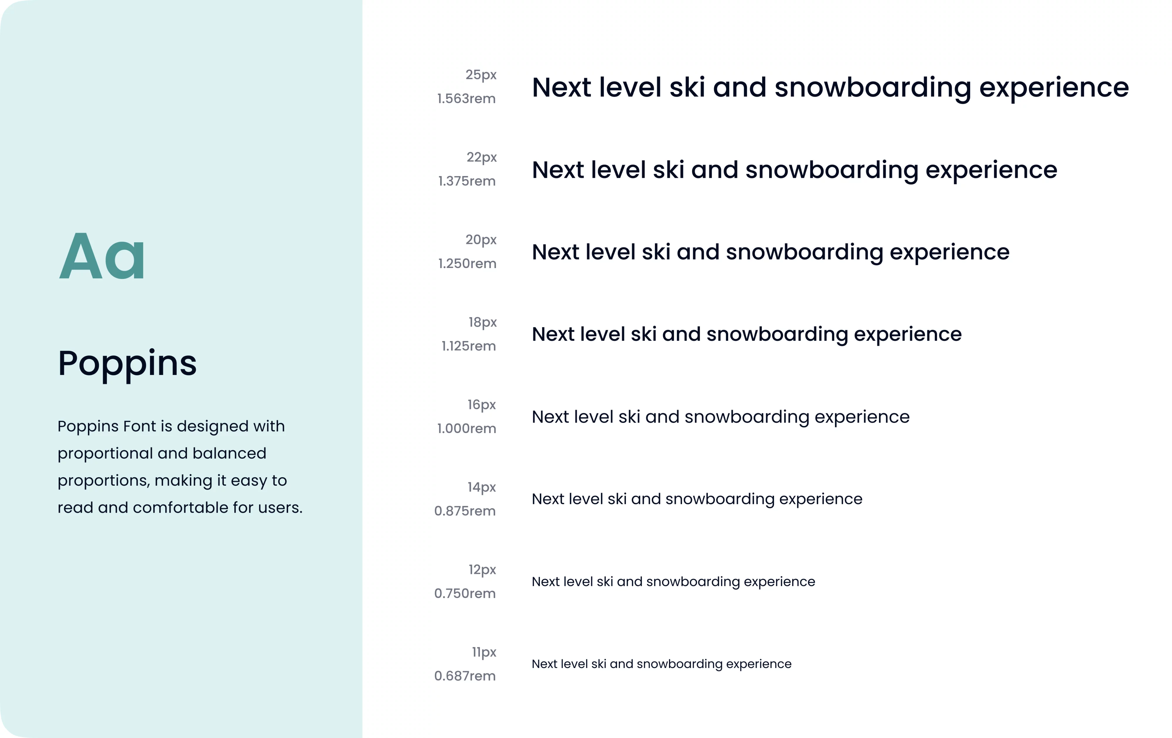
Visual & typography
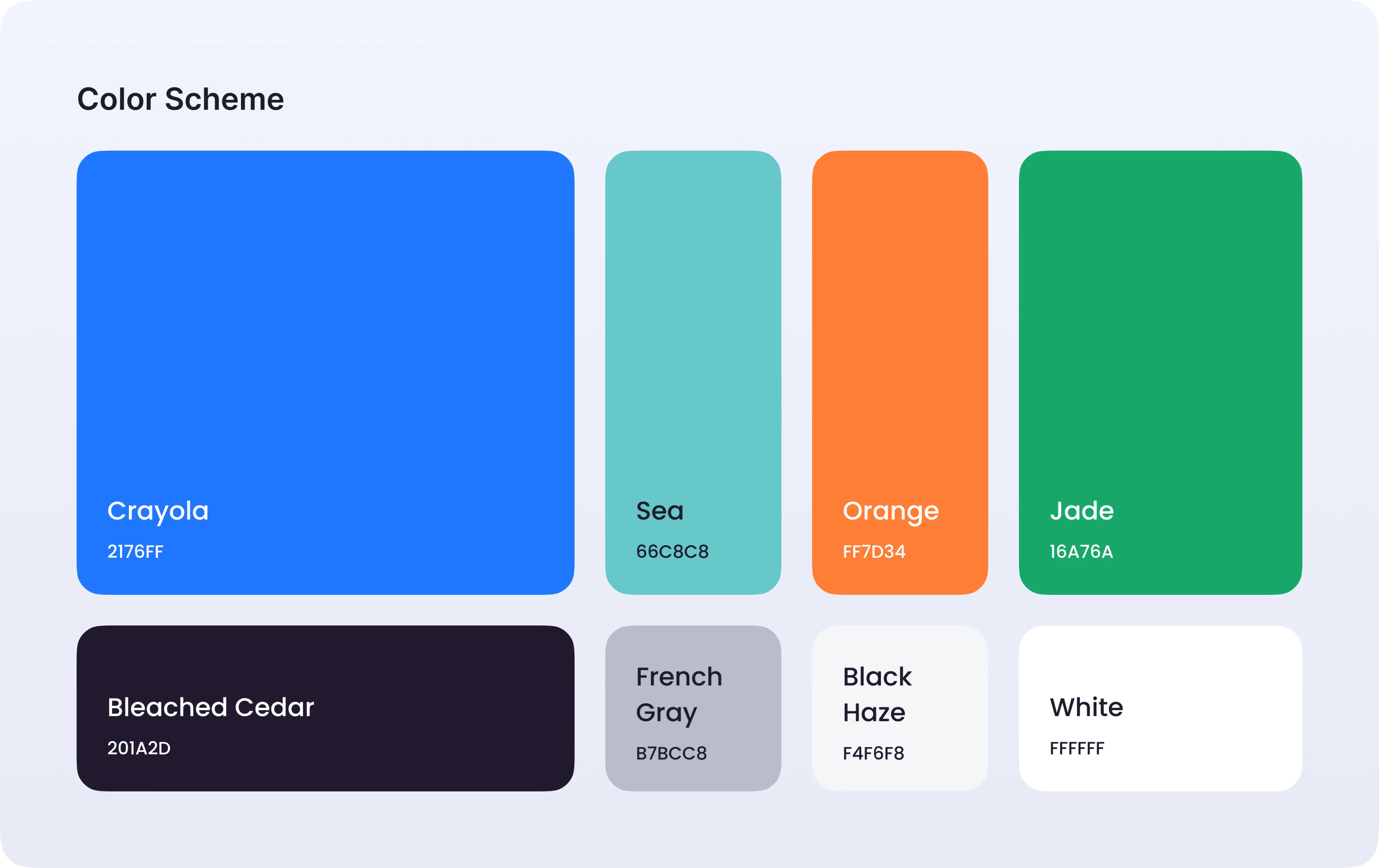
We chose the main colors of blue & white for Alpinist project based on a couple of reasons:
First, white color is often associated with snow, which is a key element in snowy mountains. It is a timeless and versatile color and can create a sense of cleanliness.
Second, the combination of blue and white palettes provides an appealing visual contrast and is easily visible in the typically bright snowy environment.
ILLUSTRATIONS
Illustrations & icons
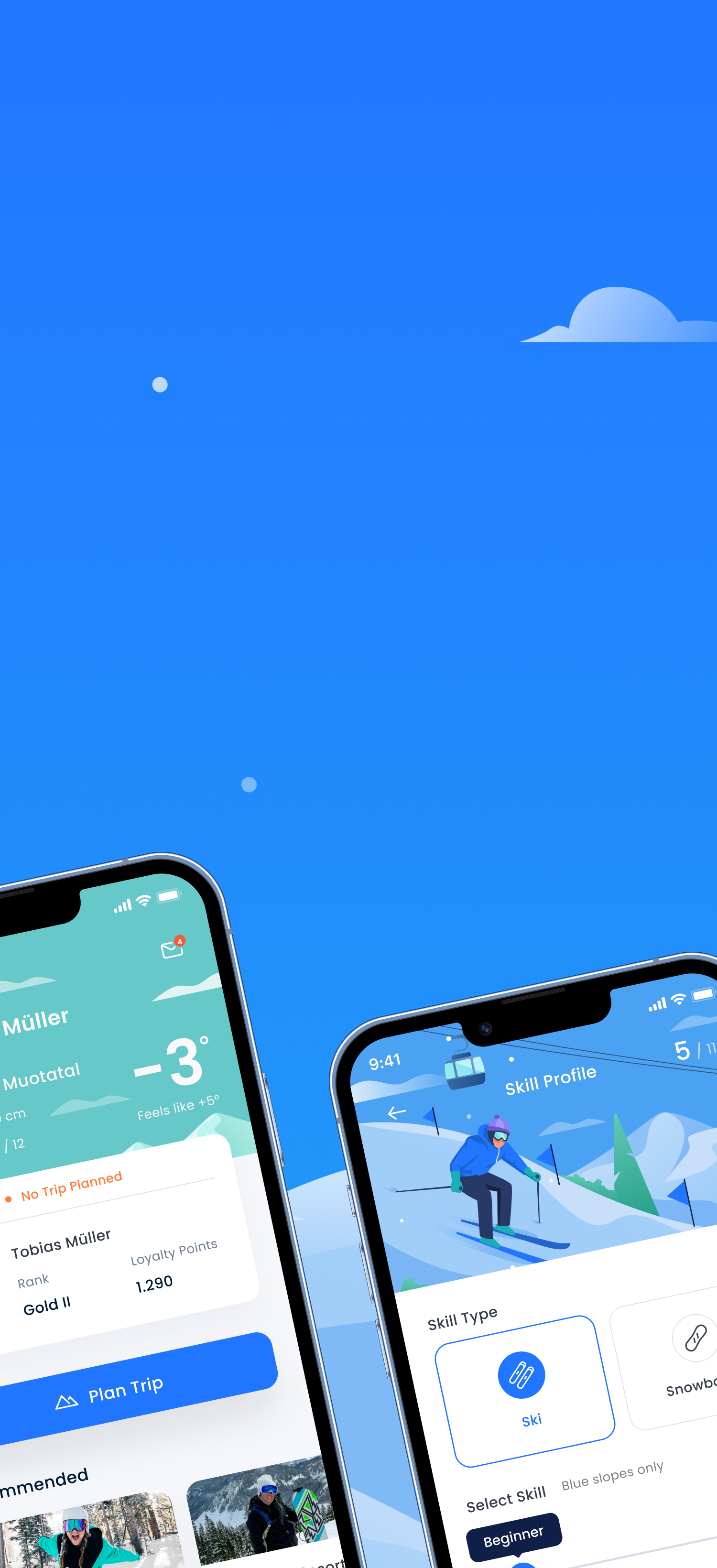
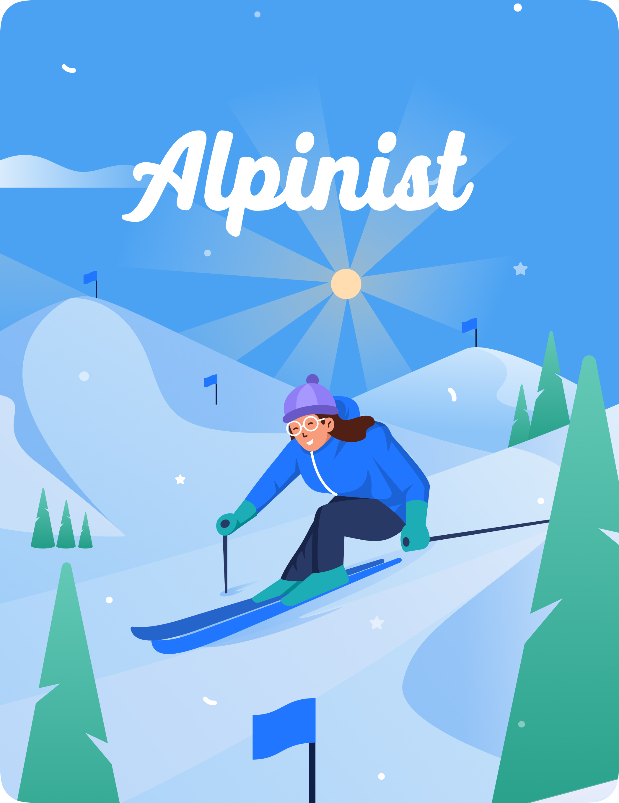
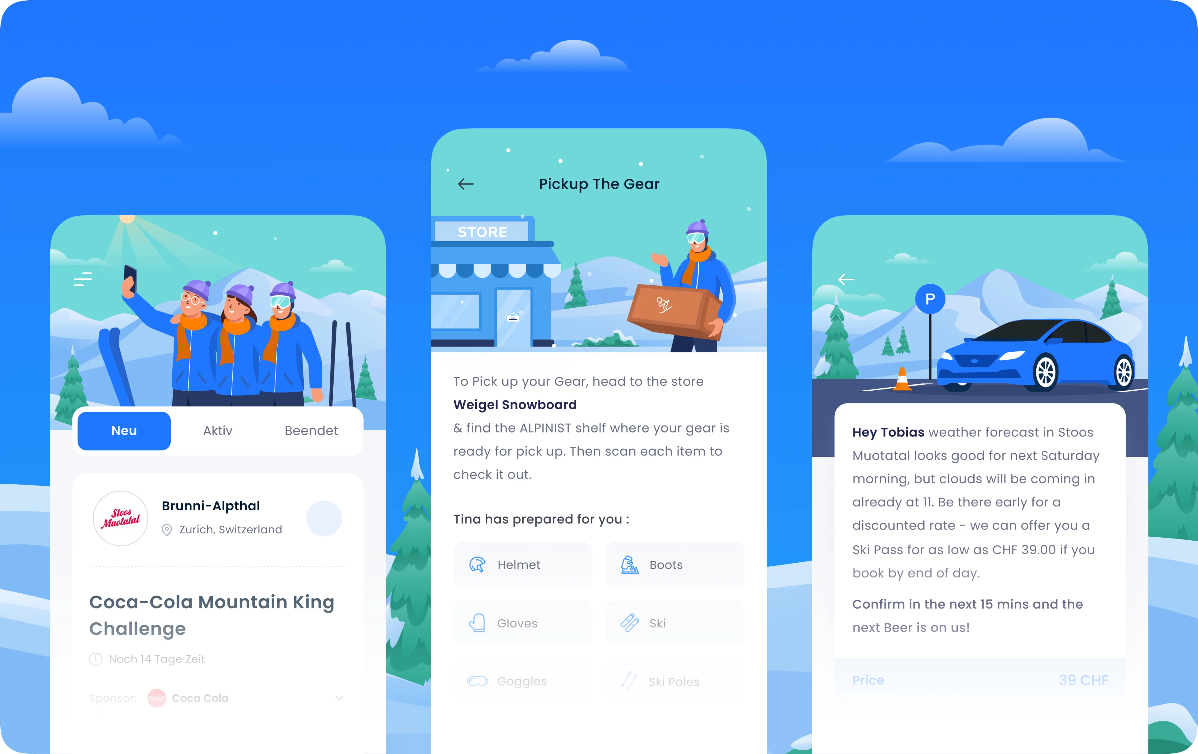
For the illustrations, we chose snowy landscapes in Switzerland and use a flat illustration style. This style is characterized by simpler illustration & icon featuring curved shapes, soft lines, and expressive facial expressions.
OUR RESULT
Smooth slope for skiers
We construct an engaging illustration solution that gives fun impact for users with a well-arranged and easy flow that’s clear for the user to reach their goal.


CONCLUSION
Superb experience
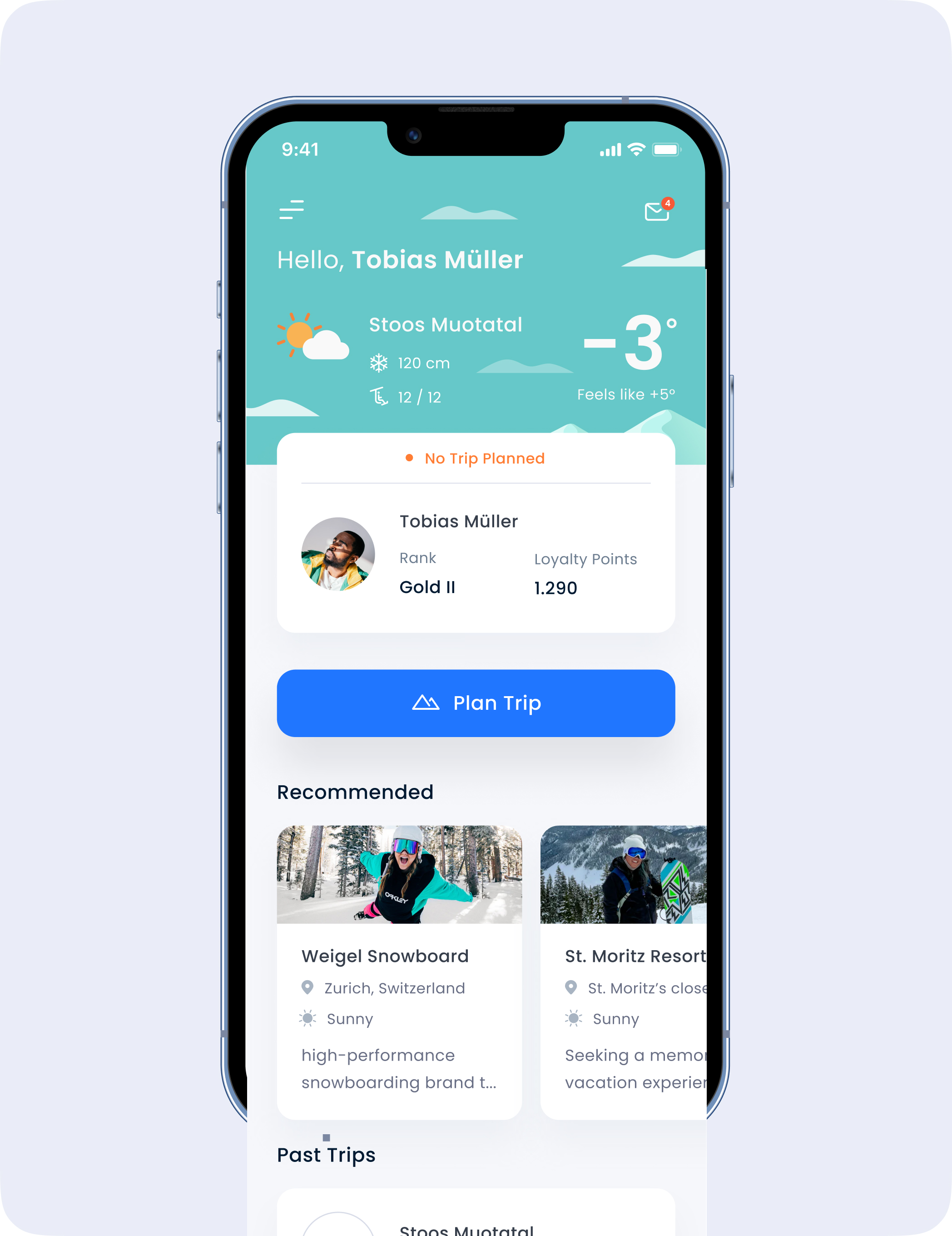
We established a clear visual hierarchy and incorporating contextually relevant illustrations accompanied by clear messaging, ultimately improving overall usability and user satisfaction.
We collaborated heavily with the Alpinist team to ensure the new design would resonate with their audience and provide a personalized experience.

